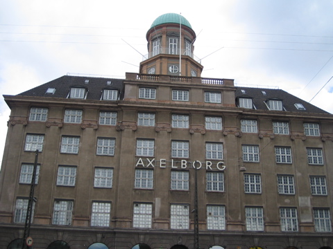
Axelborg
No idea what this is. The type on the building’s front is interesting, though it’s in bad need of better kerning. Looks like it’s on some kind of track, so it shouldn’t be too hard to space out the letters correctly.

- Photo 11 of 32
- 12 June 2005
I can enlighten you on what the building is: it’s a conference and banqueting centre. It was originally built around 1920 and was the headquarters of Andelsbanken, a major bank.
And you’re right, the kerning on the signage is horrible! Makes you want to climb up there with a screwdriver…
For the love of… Now I’ll never be able to pass by that building and not think about that! Curse you! :)
Just noticed by looking again that the poor kerning might be the result of placing letters within and between the implied vertical columns of the windows. The particularly bad spacing around the E and O certainly seem to be caused by centering those characters in the gutter.
And so suddenly it all looks quite symmetrical and pleasing to the eye. Amazing how our perception can change like that…
This field ruins us! Kerning… it’s Copenhagen!!